Project Reflection - Honey
September 14th, 2025
This project challenged me to apply both technical precision and creative strategy to the design of packaging labels, requiring the development of two complete label systems for a single product—one for a budget version and one for a luxury version. I chose one of the provided product kits and focused on creating designs that shared the same brand identity but conveyed distinctly different market positions through typography, color, layout, and material emphasis.
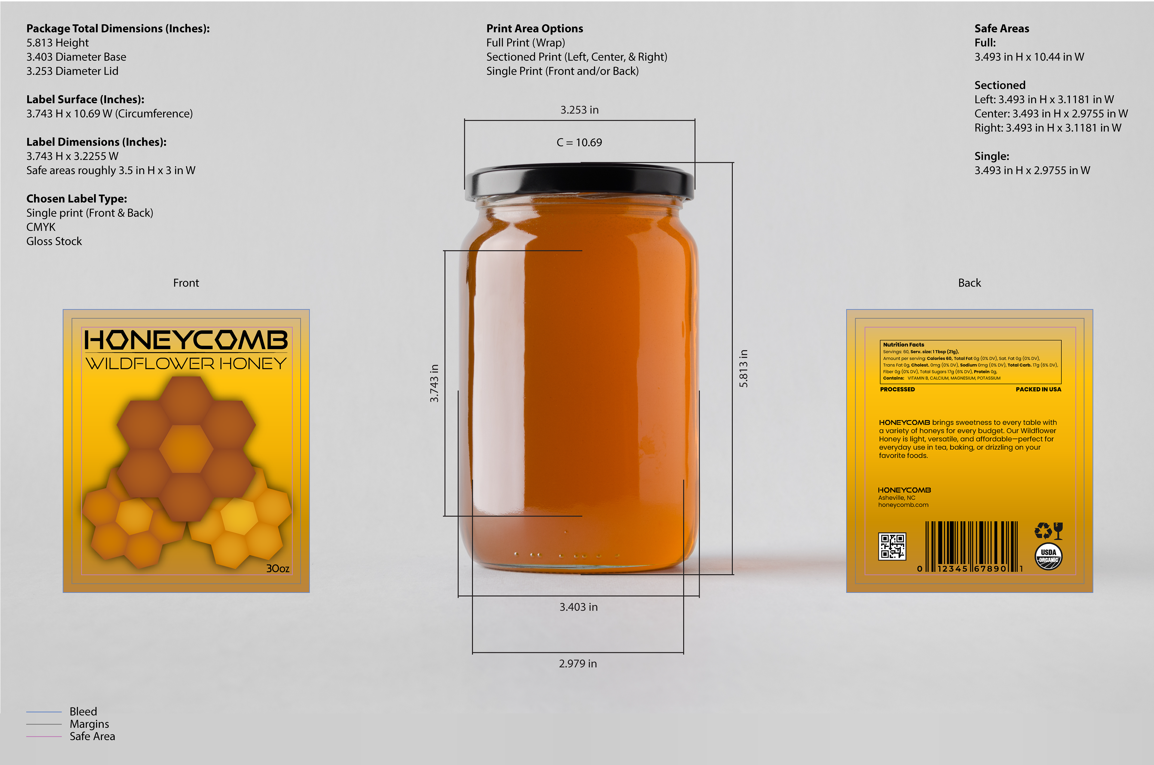
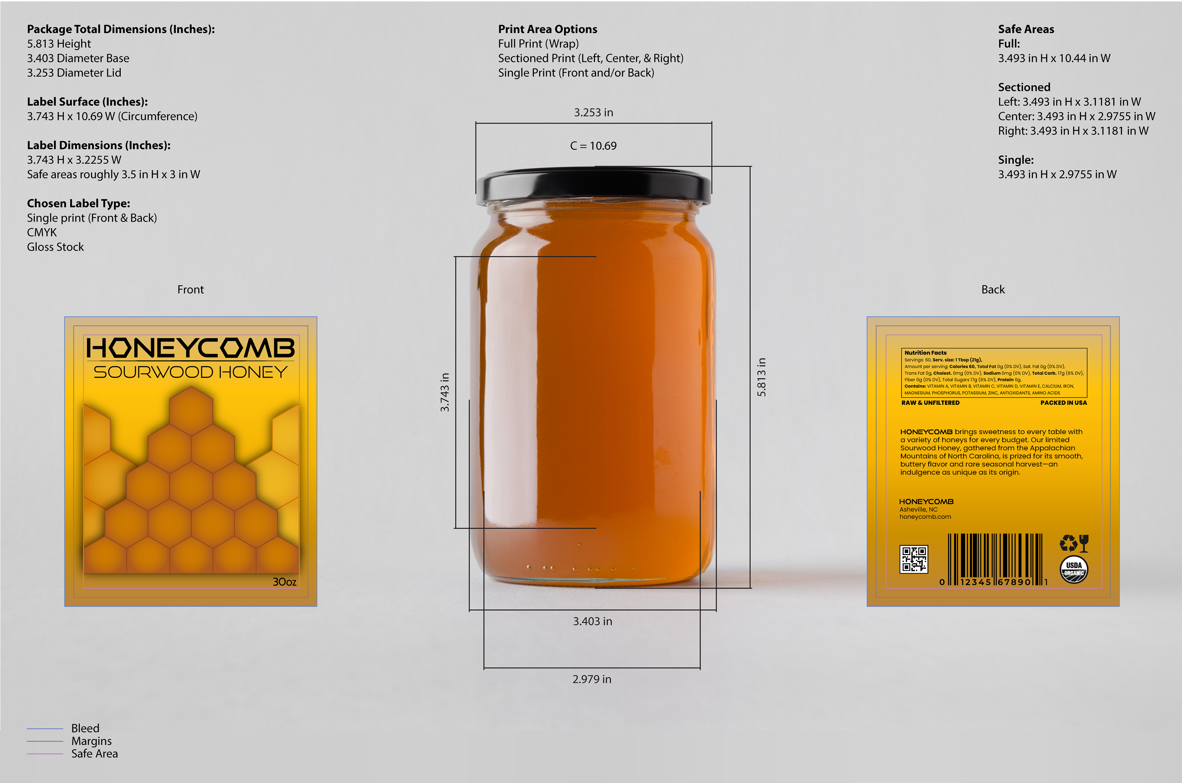
The process began with detailed research into packaging conventions, measurement accuracy, and dieline construction. I built each dieline from scratch in Adobe Illustrator, ensuring every surface dimension matched realistic proportions for the product container. This required a careful balance of creativity and technical precision—an exercise in understanding how design functions both aesthetically and structurally in three-dimensional space.
Working within the strict limitation of sticker labeling only (no shrink wraps or direct print), I explored several layout variations to determine the most effective format for each product tier. The budget design focused on clarity, accessibility, and minimal cost implications, while the luxury version emphasized refinement, hierarchy, and visual sophistication. Both designs incorporated all required packaging elements, such as product name, description, barcode, usage instructions, and nutritional or ingredient information, maintaining professional standards of completeness and accuracy.
Once the flat dielines were complete, I created mockups in Photoshop to visualize the finished products. This stage allowed me to assess proportion, scale, and real-world presentation. It was particularly rewarding to see how small adjustments in detail—like foil accents, color depth, or label shape—could transform the perceived value of a product.
Overall, this project deepened my understanding of packaging design as both a technical and narrative discipline. I learned the importance of precision in dieline construction, the impact of design choices on brand positioning, and the discipline of maintaining creative originality throughout the process. The final deliverables—two fully realized label systems, each tailored to its respective market tier—represent a comprehensive exercise in merging craftsmanship, branding, and visual communication.